UH’s Logos Over the Years
While the look may have changed, it’s always been True UH.

Founded as a junior college in 1927, the University of Houston officially became a university in 1934. As UH has evolved, so has its logo.
1928
The first known logo of our beloved Cougar mascot, illustrated by Carroll Canatella for the Houston Junior College.
1930s
The University’s first official logo was a version of the interlocking UH letters we know and love today. The ice hockey team was the first to wear the bright red block letters in 1935.
1951-1962
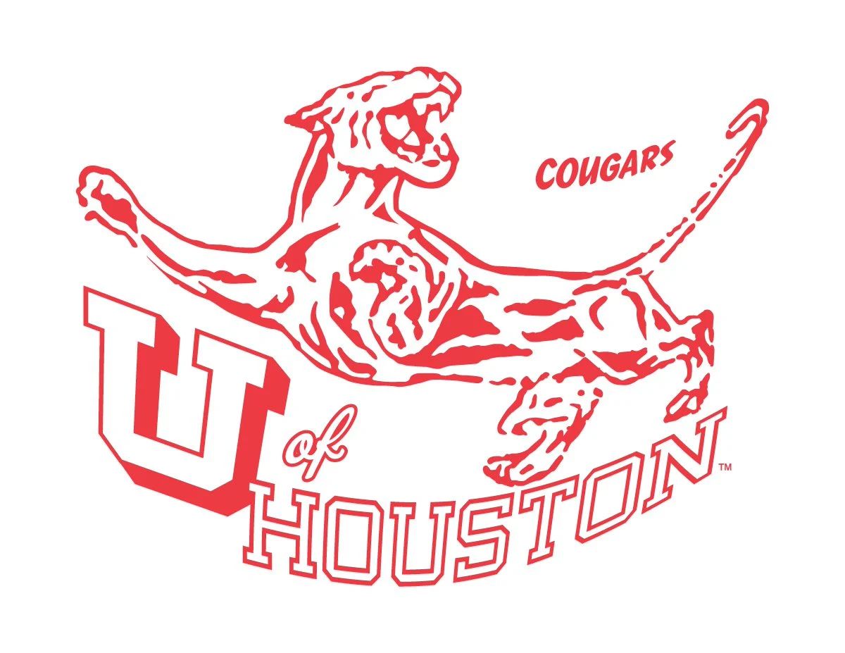
By the mid-century, UH’s minimal logo had transformed into a stylistic depiction of a Cougar outstretched as if ready to pounce over the lettering “U of Houston.”
1962-1996
In the 60s, UH returned to the early version of what would become its iconic “UH” logo. While many iterations would follow, this simple but striking, bright red logo was, and still is, easily recognizable and proudly worn.
1996-2000
As we approached a new millennium, the school took a bold approach to its vintage Cougar logo. Shasta is facing directly forward over the “Houston Cougars” lettering with a determined gaze and fighting stance as if to say, “We are ready for whatever comes our way.”
2000-2012
The University returned to its tried and true interlocked “UH” logo; this time, it took on an exaggerated look that was so popular during the 2010s.
2012-2017
The school continued to refine the unembellished interlocking “UH” logo of the 1960s and re-envisioned it nearly 50 years later with a modern twist. For five years, Cougars donned this 3D design that introduced a secondary, darker red shade to UH’s official school colors.
2017-NOW
While our current “UH” logo is an ode to where the school started, it also shows just how far we’ve come. Today, our logo illustrates the school’s forward-thinking mission while remaining rooted in what makes us “True UH.” To read more about UH’s logo evolution, visit stories.uh.edu/2022-true-uh/.


