UH Go Gets a New Home Screen and Features
The award-winning UH mobile app is now easier to use

After extensive user testing and evaluation, a new home screen for UH Go is now live. The University of Houston’s official mobile app — connecting the UH community to over a dozen services — has received a data-driven facelift to heighten user experience.
“The changes bring highly used and requested features to the forefront of UH Go,” said UH Mobile Responsive Designer Melanie Lankford. “The new home screen is personalized so that content relevant to the user can be seen at a glance.”
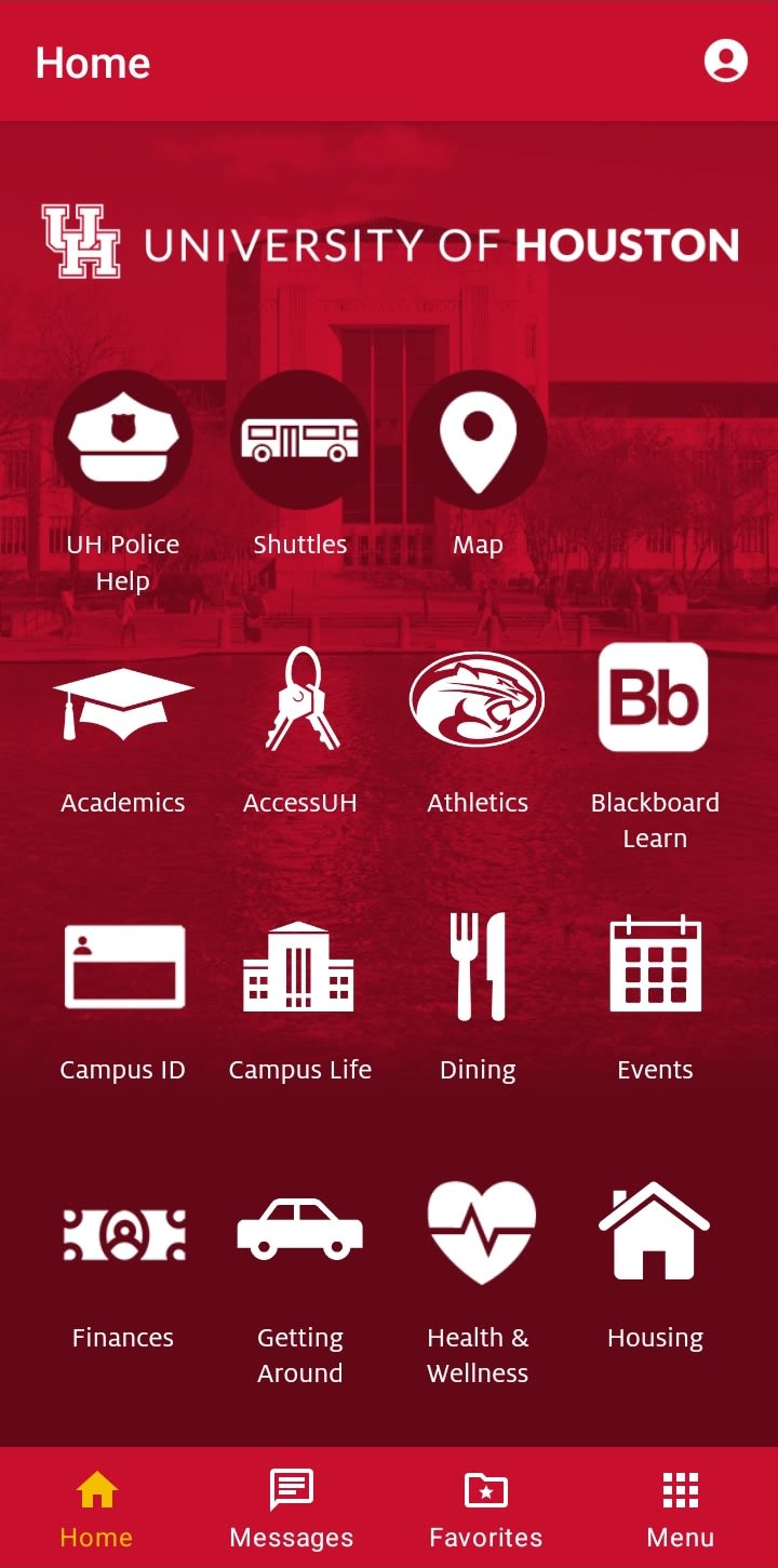
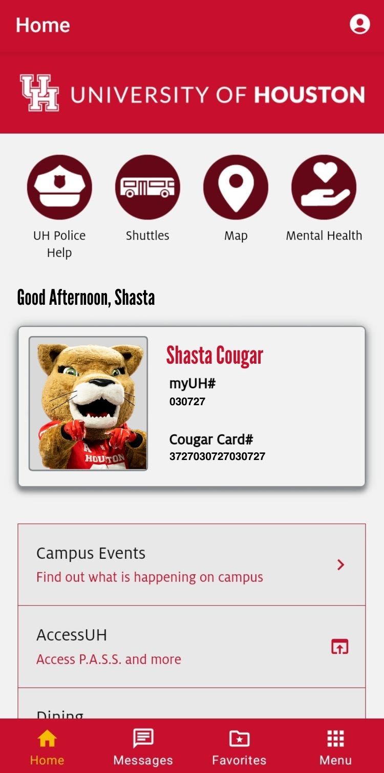
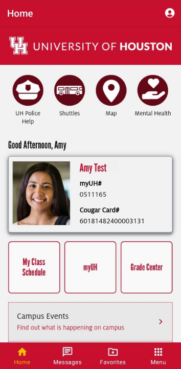
The home screen varies depending on users’ roles at UH. Students can see their grades and class schedules, while faculty and staff see the services that apply to them, such as dining options and campus events. In addition, the home screen has received a complete redesign away from the large single grid of icons to a simpler dashboard-style display, which makes it easier to find key features and content.
UH Go is better able to support student success by putting personalized tools and resources in the palms of their hands, guiding them through school and graduation, and later adapting to their needs as UH alumni.
“These enhancements will empower us to better serve the UH community — that’s our ultimate goal.”
To guide the enhancements, Lankford and her team evaluated analytics, conducted user testing and surveyed students, faculty and staff. This information was used to determine which features were visited the most, which were most necessary and how the app could grow to meet the needs of the community. As a result, the priority services displayed on the home screen for all users include: UH Police, shuttle and transportation services, IT support, the campus map and mental health services. The digital Cougar Card is now readily accessible from the home screen, too.
This is the beginning of future upgrades to the app, including an enhanced messages feature that will allow users to opt in to message notifications on specific areas of interest such as the arts, events, athletics and more. “This will keep us from overloading users with messages that aren’t of interest to them,” Lankford added.
Other pending new features include personalized content relating to daily class schedules, progress toward graduation, parking and vehicles. University Marketing and Communications, which co-manages the app along with University Information Technology, plans to roll out the additional new features this fall.
“These enhancements will empower us to better serve the UH community — that’s our ultimate goal,” Lankford said.

UH Go’s old home screen featured numerous icons making it difficult to find features
UH Go’s old home screen featured numerous icons making it difficult to find features

New faculty and staff home screen displays highly used features such as AccessUH, dining and campus events
New faculty and staff home screen displays highly used features such as AccessUH, dining and campus events

New student home screen displays class schedules and grades as soon as students log in
New student home screen displays class schedules and grades as soon as students log in
